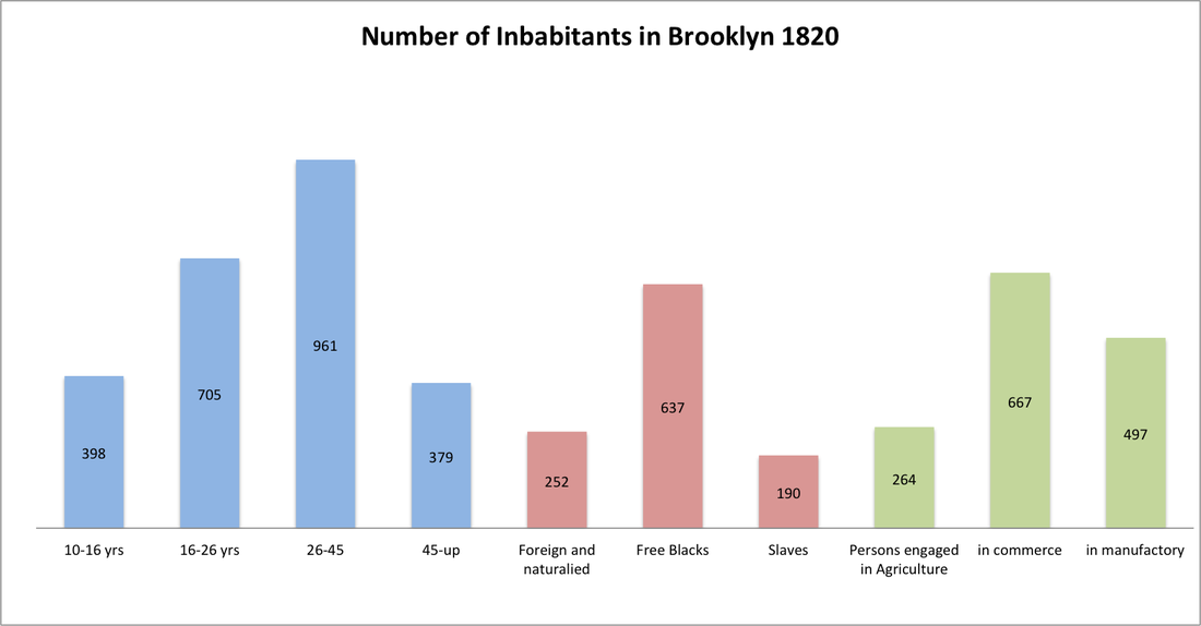
This bar graph was created by using Gabriel Furman's journal Volume 2. page 363 and 364. It represents the population of age (blue), race (red), and occupation of three types (green). I tried to make each group individual by using different colors for each. Unfortunately, Furman does not give an explanation as to why he groups these in this manner. However, at the time, there were 7,175 inhabitant in Brooklyn by 1820 in reference to this particular data. Keep in mind that this graph is separate from the previous data-- Census of Kings County. *Again, Furman based it just on the age, race, and occupation; he excluded other groups that may have accounted for the rest of the 4,012 inhabitants not included in this graph.
*If you click on the graph, you will have access to the excel spreadsheet.
